Improving Navigation in Google Photos
A UI/UX app redesign for the Android ecosystem.


OVERVIEW
Album Sizes are too Large

An online survey found that people have anywhere from 1000 - 9000 photos on their device. Over 50% of users have 4-6 large photo albums on their phone and 33% have more than 6. These are auto-generated albums and most people do not know what is in them. As a result, navigating to a specific photo may take longer than necessary.
The current navigation tools provided by the app are too broad.
USER RESEARCH
Favourites and Search Bar
To understand how users utilize the current tools to organize and find content in their gallery, I asked about their usage of the favourites function and the search bar.

Results indicated that users find photos in two ways:
-
Scrolling through the entire camera roll.
-
Using the search bar to find photos based on time.
Another survey finding indicated that, most users did not use the “Favourites” function at all.
I conducted user interviews to further investigate the problem, and to identify their pain points.
IDENTIFYING PAIN POINTS & INSIGHTS

1
“I have to scroll a lot to find an image.”
“The Favourites function is too broad.”
2
“There are too many icons I don’t use”
3
“I don’t always remember the time a photo was taken.”
4
PAIN POINTS
INSIGHTS

People want a more instantaneous process.
Only having 1 folder for favourites leads to clutter.
Unpopular features take up too much space
There should be a better way to narrow down a photo
PROBLEM
How can we improve the process of finding a photo
so that users can access them effortlessly?


Similarly, the contents in the album section are unintuitive. Users reported that they have not used the “Order Photos” button before. Furthermore, key organizational buttons such as “Edit Album” and “Select Photos” are hidden, which forces users to take extra steps to sort an album.
In order to make the accessibility of photos easier, I began by cleaning up the UI. To start, I asked users to rank the navigation tabs in order of most used to least.
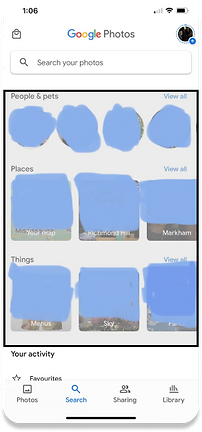
When asked about this section in the Search tab, users reported that they have never interacted with the contents here. Therefore, more “useful” content can be displayed instead.
ITERATIVE PROCESS
Cleaning Up the UI
Most users chose A, D, B, & C as the order which is interesting because in the original interface, “Photos” and “Library” were the furthest apart.
Most users chose A, D, B, & C as the order which is interesting because in the original interface, “Photos” and “Library” were the furthest apart.
Most users chose A, D, B, & C as the order which is interesting because in the original interface, “Photos” and “Library” were the furthest apart.
By moving around the icons in the navigation bar in the correct order based on user data, users should have an easier time switching between tabs without having to stretch their thumb.
Furthermore, the “Things, People, Places” section was moved down and must be reached by scrolling. The folder navigator was brought up. This allows for more accessibility.
While this provides a solution for pain point 3, how do we solve for a Favourites feature that is far too broad, and how do we obtain a more defined search?
Interestingly enough, cleaning up the UI has opened up many new possibilities...


SOLUTION
Rearranging the Icons
INTRODUCING THE “FEATURED” TAB AND AN ENHANCED SEARCH SYSTEM
The “Featured” tab is a tab in every album that users can switch to, to view photos that they “Featured” in an album. The tab is album specific, which means that there will no longer be the issue of having one broad “Favourites” folder for all photos, videos, and screenshots. This makes it easy to revisit photos that have been featured in a specific album for quick access.


After
Before
Add Photos moved.
Removed row
Edit Album and Select Photos made accessible
“Featured” tab introduced
NEW SEARCH SYSTEM
The search system can now narrow in on specific albums which eliminates the problem of having overly large search results. This function also allows the user to search for a photo during a specific time, before a specific time, or after a specific time while also having this ability to narrow in on folders. A user can also use Google’s object recognition feature to search for objects in photos like before, but the ability to hone in on specific folders makes the process of finding a photo easier.


REFINED SEARCH BY ALBUM AND DATE
CONCLUSION & NEXT STEPS
Users can now easily revisit photos that they've featured and search for photos using a more refined search tool. Along with the addition of a cleaned up UI, users can be more efficient when it comes to navigating and retrieving media.
Next steps include conducting A/B tests to further refine the added features.

Thanks for reading :-)
If you enjoyed or have any comments, feel free to shoot me a message.